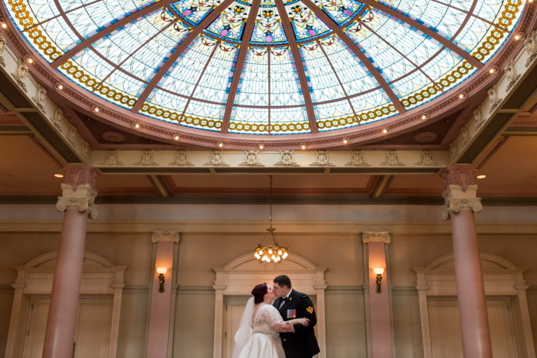
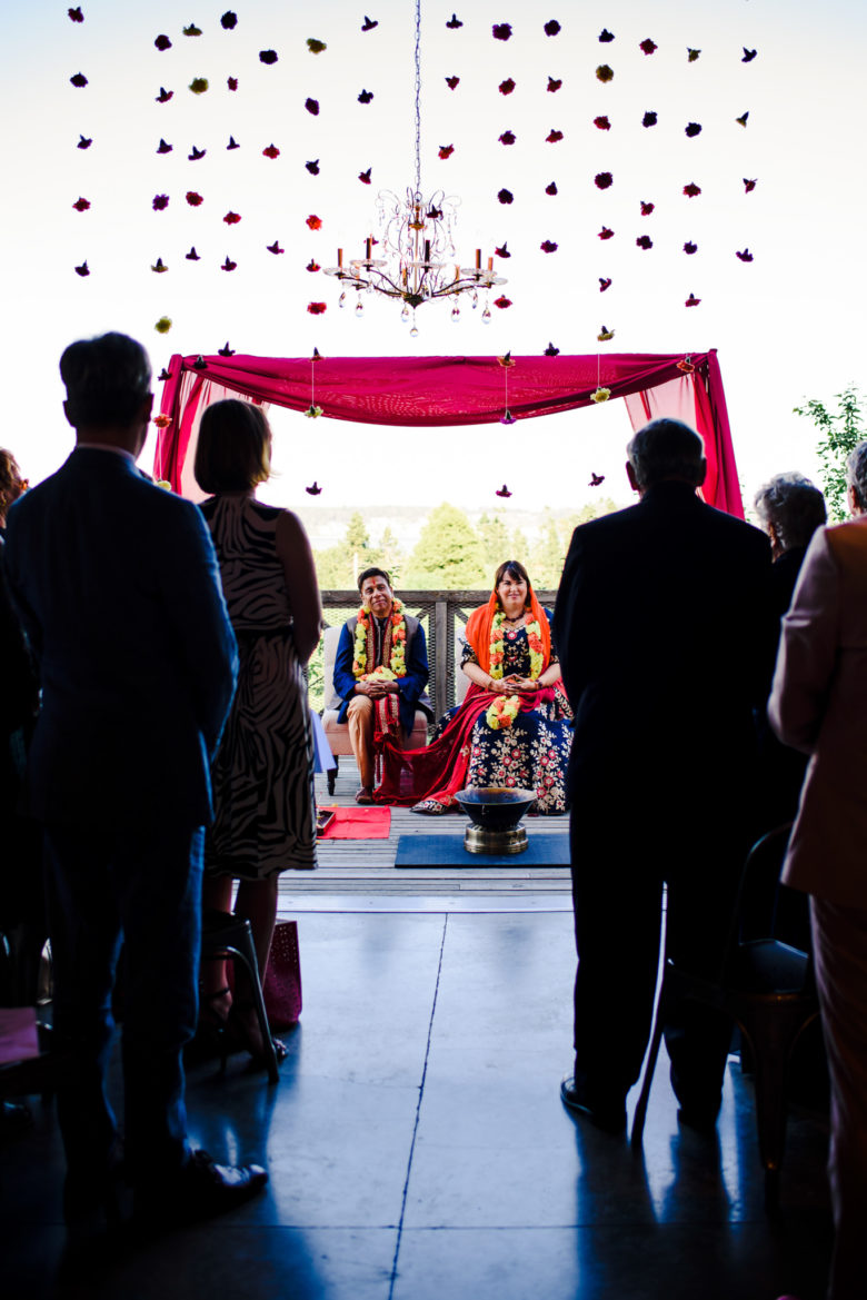
This week’s theme is symmetry. Symmetry is one compositional tool you can use to make your images more interesting and pleasing to the eye. Symmetry is when one half of the image is identical to the other, split vertically or horizontally (or both). It doesn’t have to be perfectly symmetrical to have the desired effect, especially if you throw something like a couple or other subject into the image. In that case, you might rely on the overall environment to provide the symmetry.


Here are some tips on using symmetry:
- Be careful about angles and cropping to avoid an unsettling slightly crooked look. If you stand slightly off-center to a symmetrical scene, then all of the elements of the scene will be skewed, which can be distracting. I’m definitely guilty of not squaring my frame properly, as you can see in some of my examples with a lot of lines.
- Try including other compositional techniques as well to keep visual interest up. Some examples are rule of thirds and leading lines. Pay attention to where your eye goes in the frame. It should still have a focal point or subject.
- If a scene is pretty symmetrical, but contains a distraction off to one side, try cropping in closer to remove it.
- You can create symmetry by using a reflection, such as with a body of water or using a mirror/phone.
- Look for symmetry in your environment. Buildings are a great source of this, especially places like churches or commercial buildings.
If you have any questions, join us in the Facebook group. I’ll be checking in there daily to see your work and help you achieve the best results.
If you’re just finding this now, you can check out the full list and more information on the challenge here. You can follow me on Instagram at @documentyourdaytoday and use the hashtag #dtd52weeks so others doing the challenge can see your work.
