Week 43 – Framing

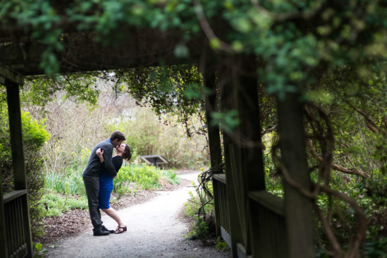
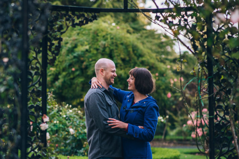
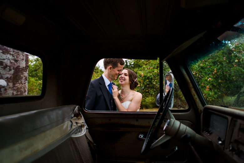
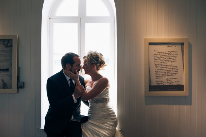
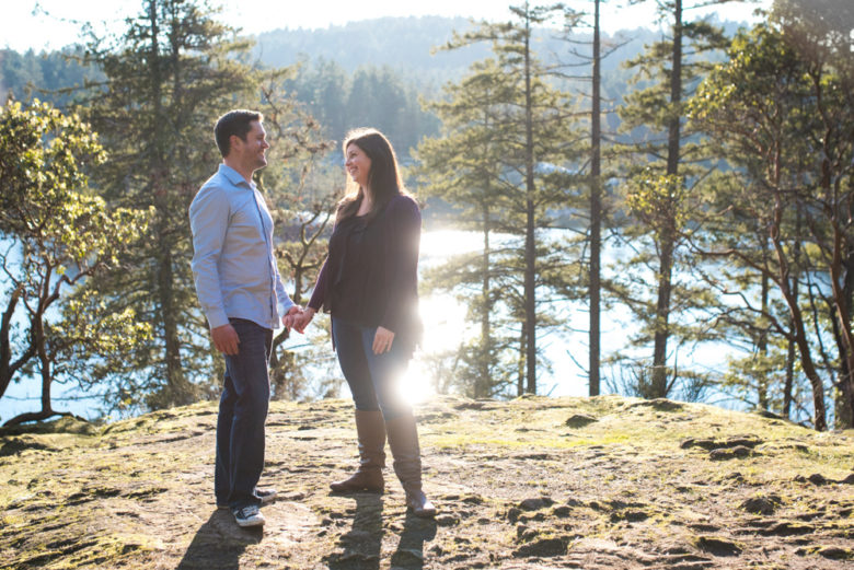
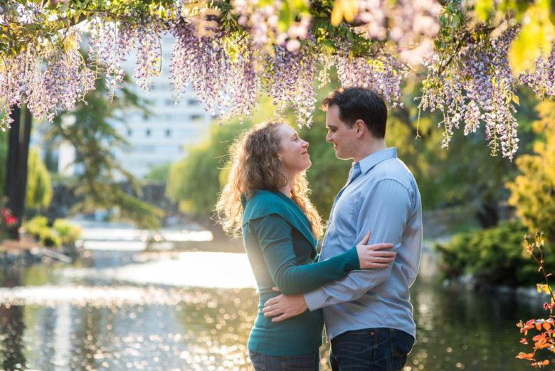
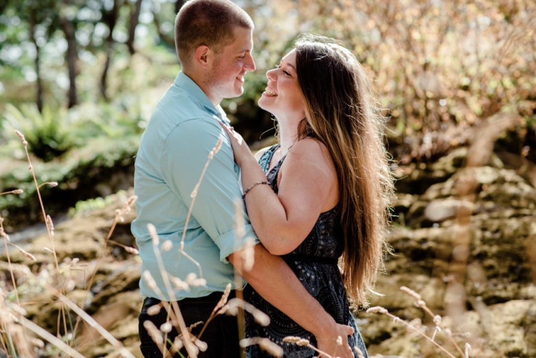
This week’s theme is framing. Framing is kind of like a picture frame, where you use elements of the scene to frame your subjects. You can use obvious things like windows, doors, and mirrors. Or you can shoot through something in the foreground, like leaves. I like putting my lens really close to leaves of a bush to create a blurry foreground element (more on this here) that puts focus on the subject and adds a pop of colour.
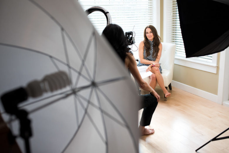
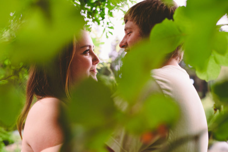
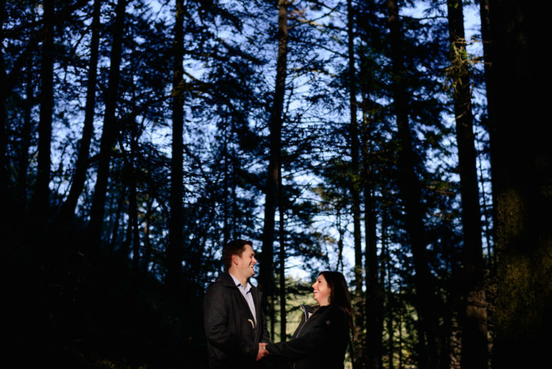
As usual with composition challenges, think about the way your eye moves through the image. The framing element(s) should draw attention to your subjects, not (just) to itself. It can also add to the story, like the photo of the couple taken through the car window or the video lighting equipment used as framing in the first photo.

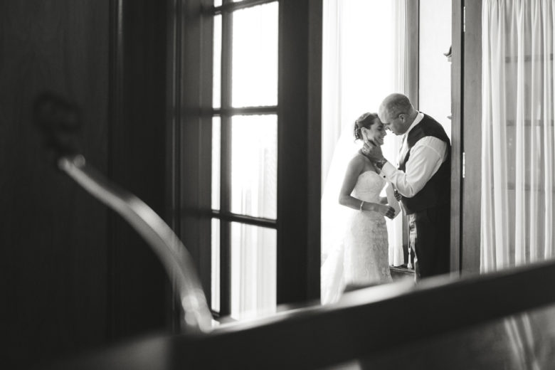
Framing can also make a moment feel more intimate as it creates separation between the camera and the subjects. If can feel like peeking in on a private moment.

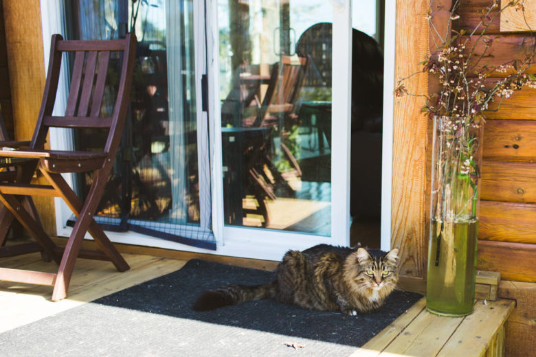
You can, of course, also do this with subjects other than people, like a tree, an animal, a building, etc.

One thing to be cautious with when framing your subject is focus. You’ll typically want to focus on your subject and not the frame, though rules are made to be broken. You should move your focal point around to make sure it’s on your subjects or use focus-and-recompose. If your framing element is really close to the lens, your camera probably won’t be able to focus that close anyway, so letting your camera choose what to focus on may work in that case.


If you have any questions, join us in the Facebook group. I’ll be checking in there daily to see your work and help you achieve the best results.

If you’re just finding this now, you can check out the full list and more information on the challenge here. You can follow me on Instagram at @documentyourdaytoday and use the hashtag #dtd52weeks so others doing the challenge can see your work.

Week 42 – Catch Lights

This week’s challenge is catch lights. This one requires a subject. If you don’t have someone to model for you, try a pet or a self-portrait.

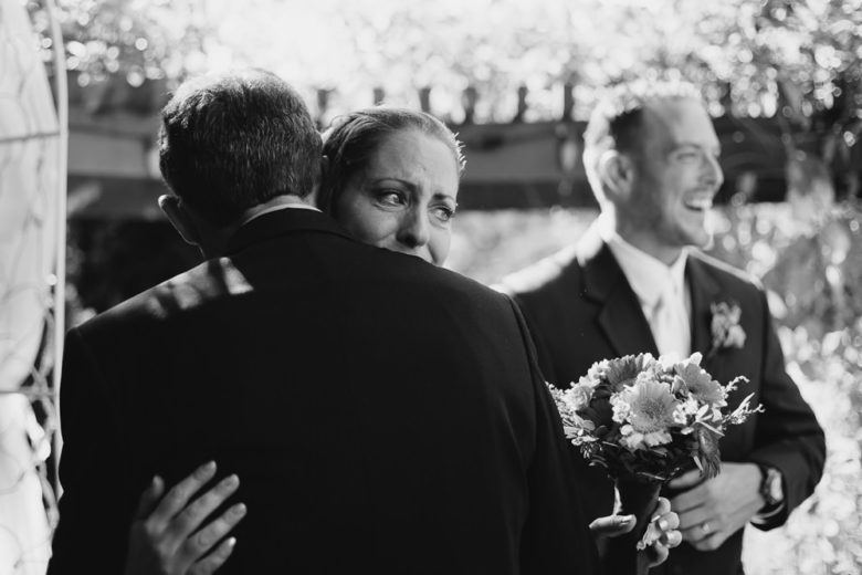
Catch lights are that small reflection in someone’s eye that gives them a little sparkle. Portraits that lack them can look a little lifeless (or you can intentionally have no catch lights for a moody, dark look).

The easiest way to get a catch light is to have the subject facing the camera and have a light source hitting their eyes. I actually didn’t have a lot of portrait examples because most of my portraits are actually lightly directed photos of couples of families, so they don’t involve people looking at the camera. But I did find a bunch of candids that feature catch lights anyway. Turns out people crying really makes those catch lights pop, plus the catch lights give the eyes some extra emotion.

I find the nicest catch lights come from a larger light source like a window, a reflector, or the sun. A pop-up flash can produce a very tiny, pinpoint catch light, which doesn’t look great. If you’re having some trouble figuring out how to get catch lights, try using a constant light source like a video light or a lamp and moving it around your subject while looking at their eyes to note if there’s a catch light. Alternately, you can move your subject around until you see the light in their eyes.


If you have any questions, join us in the Facebook group. I’ll be checking in there daily to see your work and help you achieve the best results.

If you’re just finding this now, you can check out the full list and more information on the challenge here. You can follow me on Instagram at @documentyourdaytoday and use the hashtag #dtd52weeks so others doing the challenge can see your work.

Week 41 – Photograph an Animal

This is a pretty simple challenge this week. Go photograph an animal, either a pet or a wild animal. Get close, use a zoom lens, capture their relationships with each other or humans, or get creative by combining this with any of the previous week’s themes. Here are a couple of animal photos I captured, mostly at client sessions or weddings. If you have a pet at your wedding, you can bet I’m going to take a ton of photos of it.


If you have any questions, join us in the Facebook group. I’ll be checking in there daily to see your work and help you achieve the best results.

If you’re just finding this now, you can check out the full list and more information on the challenge here. You can follow me on Instagram at @documentyourdaytoday and use the hashtag #dtd52weeks so others doing the challenge can see your work.

Week 40 – Light Painting

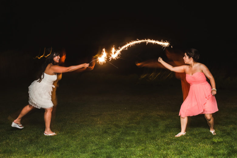
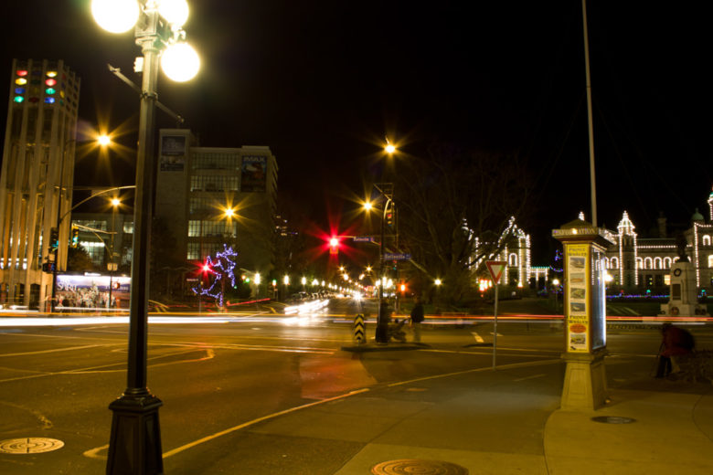
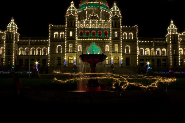
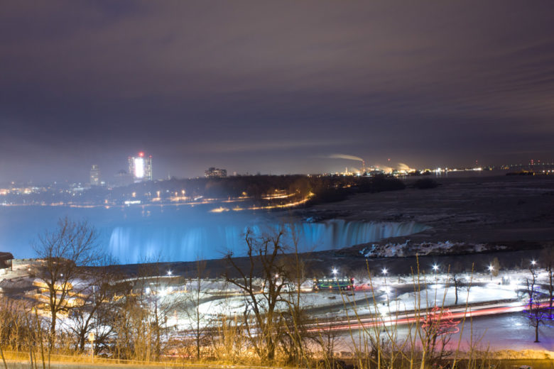
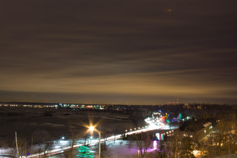
This week’s theme is light painting, which is when you take a long exposure photograph and use a light source to “draw” something through your image. I’m also including things that “draw” for you, like cars driving by. You’ll want to use a longer exposure starting around half a second or up to as long as you please. It’s also good to keep your ISO low so you don’t end up with too much noise. I’ll include my settings in captions below to illustrate.

The above two photos were taken during a wedding and without a tripod. The first image was taken with mostly the sparklers providing light (and some ambient from the moon and a nearby building). The girls are blurry because of camera shake due to the slow shutter speed. The second image was taken using flash, which froze the girls’ motion, though you can see some ghosting behind them.

The bottom four images were all taken with a tripod or the camera resting on a ledge. I recommend this method for taking long exposure photos so the stationary, non-light parts will be sharp. Lights, or very well lit things like subjects with flash, tend to be frozen in a long exposure image because your sensor captures their light faster than things that aren’t as well lit. Hence why the sparklers still look sharp in the first two examples even without a tripod.

So this week, go find some sparklers, flashlights, a video light, glow sticks, or something else that provides a bright light, and paint something in the air. Or go capture some car taillights or headlights going by. Just set your shutter speed to half a second or longer and set your ISO between 100 and 400 or so. If you want the non-light things to be sharp, use a tripod or rest your camera on something.


If you have any questions, join us in the Facebook group. I’ll be checking in there daily to see your work and help you achieve the best results.

If you’re just finding this now, you can check out the full list and more information on the challenge here. You can follow me on Instagram at @documentyourdaytoday and use the hashtag #dtd52weeks so others doing the challenge can see your work.
Week 39 – Triangles

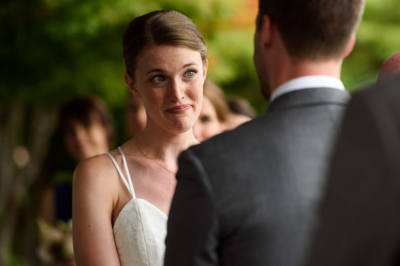
This week’s theme is triangles. Geometric shapes catch our eyes, but the triangle in particular is a very strong shape. It can draw your eye in and keep you looking at the photo as your eyes move from point to point. By triangle, I mean actual triangles, lines that converge to form a triangle, or just three noticeable points that create a triangle when mentally connected.

I couldn’t come up with some examples containing actual triangles for you, but here are a couple of ways to use them. You can use them in portraits by positioning three people to form a triangle (or even fewer people with their limbs or heads forming a triangle). These examples are candid, but this can work really well with portraits.

These aren’t perfect examples of triangles, but they give you an idea of how angles that converge at three places can draw your eye around the frame. These strong angles are kind of hard to ignore.

Get out there this week and find me some better examples of triangles or position three things or people to form a triangle in your frame.


If you have any questions, join us in the Facebook group. I’ll be checking in there daily to see your work and help you achieve the best results.

If you’re just finding this now, you can check out the full list and more information on the challenge here. You can follow me on Instagram at @documentyourdaytoday and use the hashtag #dtd52weeks so others doing the challenge can see your work.
Week 38 – Spotlight

This week’s theme is spotlight, or pools of light, which is when there is only a portion of your scene that has light in it, like a spotlight on a dark stage.

Part of the magic of this is due to the dynamic range of cameras vs. the dynamic range of our eyes. In the range of the brightest light to the darkest dark, our eyes can only see part of what exists, at least at the same time. Cameras can only capture a certain range of light, less than what our eyes can see. Our eyes adjust to the lighting in our environment and adjusting your camera’s exposure does the same thing. So if you capture more detail in highlights, you might have to sacrifice detail in the shadows. Hence, why if you expose for really bright highlights, like on a spotlit subject, the darker parts of the scene will go really dark or even pure black.

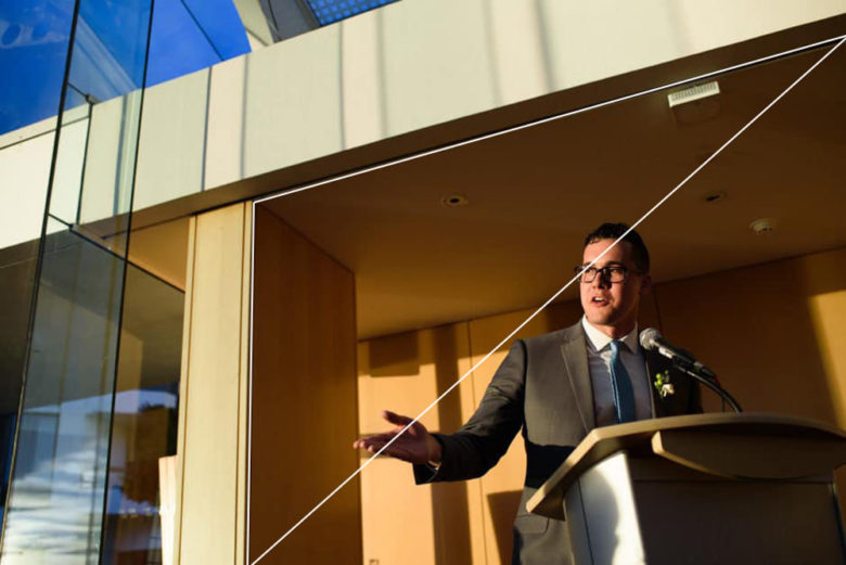
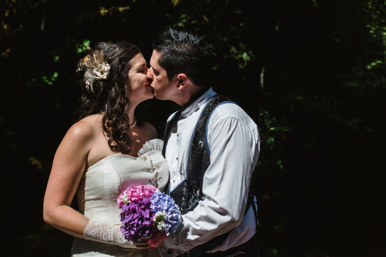
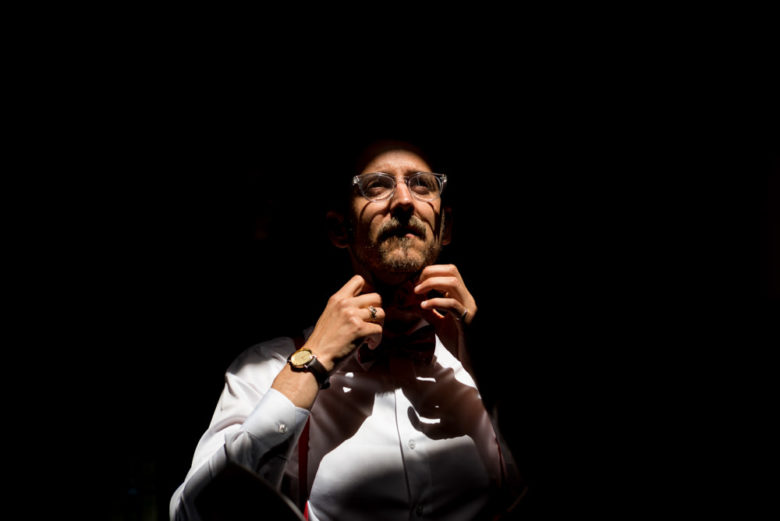
That’s the key here: exposing for highlights. And noticing when a scene has more dynamic range than your camera can handle. If your subject is in really bright light and nothing else is, you can get the spotlight effect. Below are a few examples. For the first two images, I noticed the spotlight effect during wedding ceremonies, both due to the sun shining through trees or buildings. Actually, I think the first one was a portrait I took in the same place as the ceremony because I thought the lighting suited them. The third image of the groomsman putting on his tie was candid as well. He was in a foyer that was kind of messy and normally lit, but a skylight above him was really lighting up his face. I exposed for the light on his face and everything else went dark. The last image was in a beam of sunlight breaking through the trees, though this time I purposely placed them there.


If you have any questions, join us in the Facebook group. I’ll be checking in there daily to see your work and help you achieve the best results.

If you’re just finding this now, you can check out the full list and more information on the challenge here. You can follow me on Instagram at @documentyourdaytoday and use the hashtag #dtd52weeks so others doing the challenge can see your work.
Week 37 – Mood

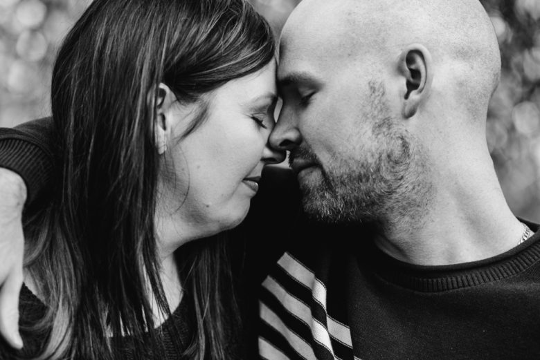
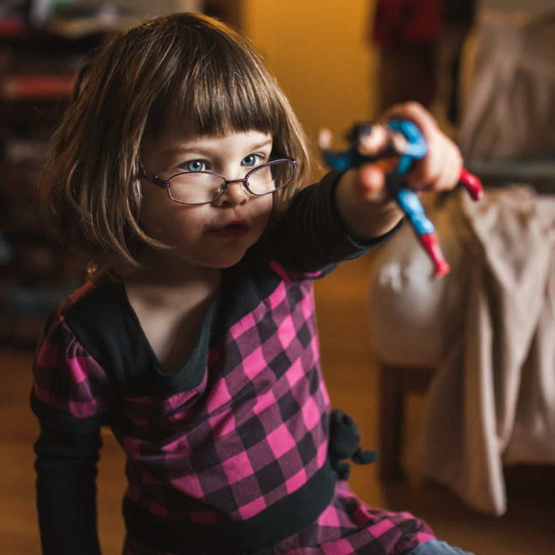
So, we’ve already done expression and emotion without showing a face. This week, we’ll combine these concepts along with some other factors that influence mood in an image: colours/editing, lighting, composition, framing, etc. Below are some example photos that make me feel something from romance to intimacy and joy to solitude. The images are about the people and their faces and body language convey their emotion, but there’s more to it than just that. Below, I’ll discuss some other ways to create mood in an image.

Here are some ways to create mood in photography:

  1. Colour and editing: black and white images can feel more serious and solemn, but also can be romantic and intimate. Some photographers say that if colour doesn’t add anything to your image, make it black and white. I personally only make something black and white if that edit adds something, like enhancing a serious, elegant, or romantic mood. It’s good to think about what the colours in your image add to it though and what kind of feeling they convey. Bright colours convey joy or excitement. Warm colours and lighting create a warm feeling. Cool colours are peaceful and calming.
  2. Lighting: pretty, glowy backlight or warm lighting can make an image seem happier, warmer, inviting, or romantic. Darker, semi-silhouetted lighting creates mystery and intimacy. Overcast skies can feel kind of sad or lonely.
  3. Framing: framing can isolate your subject, drawing attention to them, but it also makes them feel separate from the rest of the image, or the rest of the world. Like the fourth image of the couple framed in the doorway, the framing makes it feel like you’re peeking in on an intimate moment.
  4. Composition and position relative to other people: putting people in the middle of a lively crowd creates an excited mood, while the photo of the little girl sitting in the sand with all the adults’ legs around her creates a feeling of solitude. Think about what other elements you’re including in your image and how that changes the feel of it.

This week can be pretty simple, just conveying a mood in your photo. But if you take into account all of the above, it can be a real challenge, but it can create a powerful image.


If you have any questions, join us in the Facebook group. I’ll be checking in there daily to see your work and help you achieve the best results.

If you’re just finding this now, you can check out the full list and more information on the challenge here. You can follow me on Instagram at @documentyourdaytoday and use the hashtag #dtd52weeks so others doing the challenge can see your work.
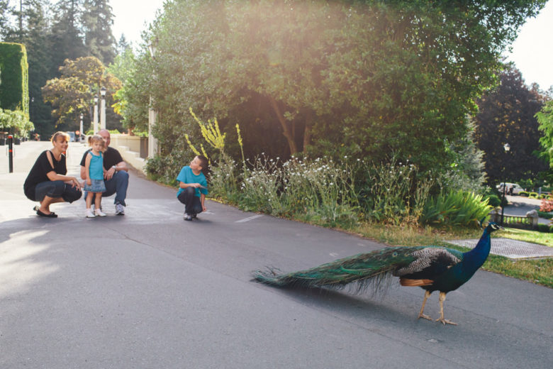
Week 36 – Slow Shutter Speed

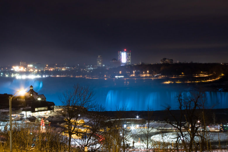
This week’s theme is slow shutter speed, which I’m realizing is a technique I don’t use very often, so I had to pull some older personal photos for this post and even one on film. The main purpose of this challenge is to show motion using a slow shutter speed. I’ll get into the technical ways to do this near the bottom of this post.

A slow shutter speed means using a lower number, like half a second or a second instead of a higher number like 1/500 of a second. When your shutter speed is slow, that means it’s open for longer. While the shutter is open, your camera is capturing the image. So, for example, if someone runs by, you’ll capture their path from when the shutter opens until it closes. If the speed is pretty slow, they’ll show up as a blur. If it’s fast, their motion will appear frozen.

Below are a couple of examples showing different shutter speeds in the same situation. The left image has a speed of half a second, which isn’t super slow, but was slow enough to blur the dancing fountain’s water. The right image is at 1/500 second, which is fast enough to capture fast human motion, but still somewhat blurs the water.

Here’s another example of the classic waterfall shot. I used a tripod and a shutter speed of 20 seconds. Notice the cars going by in the foreground just show the blur of their taillights (which is another classic slow shutter speed exercise).

The below image was taken on film, so I’m not sure what the shutter speed was, but it looks pretty slow since everyone appears kind of ghostly and faded. If someone moves during a slow shutter speed photo, they can appear as a blur or ghosted. This ghosting happens with slow shutter speed photos using flash too, but the subject that’s lit by the flash will appear frozen while a ghost image of them appears blurry nearby.

Below are two examples of light painting. Light painting is when you use something brightly lit, like sparklers in both these examples, and use it to “paint” in your image. Since the sparklers are so bright, they get captured on the camera’s sensor faster than the rest of the scene. So while the girls look blurry in the left image, the sparklers look pretty sharp. The left image uses a shutter speed of 0.6 seconds and the right is 8 seconds (with a tripod).

Here are a couple of ideas of how to get a slow shutter speed if your camera doesn’t have manual exposure or you don’t know how to use it (check out my Camera Basics online course if you’re ready to learn):

  • If you don’t know how to use manual on your advanced camera, you can use shutter-priority instead. It’s usually denoted by S or Tv on your exposure dial. Shutter priority lets you set your shutter speed and the camera will choose the aperture to get a proper exposure. Choose a shutter speed of 1/15 or below. You can also set your ISO to auto in your settings or just choose an ISO yourself if you know how. If the image is over or under exposed, use exposure compensation to make it brighter or darker. This is usually done by pressing the +/- button and turning your main dial (also used for shutter speed without the button pressed).
  • If you’re using a phone or point-and-shoot, try taking photos in a dark situation. These cameras will usually compensate for the lack of light by lowering your shutter speed.

If you have any questions, join us in the Facebook group. I’ll be checking in there daily to see your work and help you achieve the best results.

If you’re just finding this now, you can check out the full list and more information on the challenge here. You can follow me on Instagram at @documentyourdaytoday and use the hashtag #dtd52weeks so others doing the challenge can see your work.

Week 35 – Negative Space

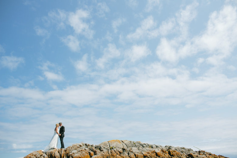
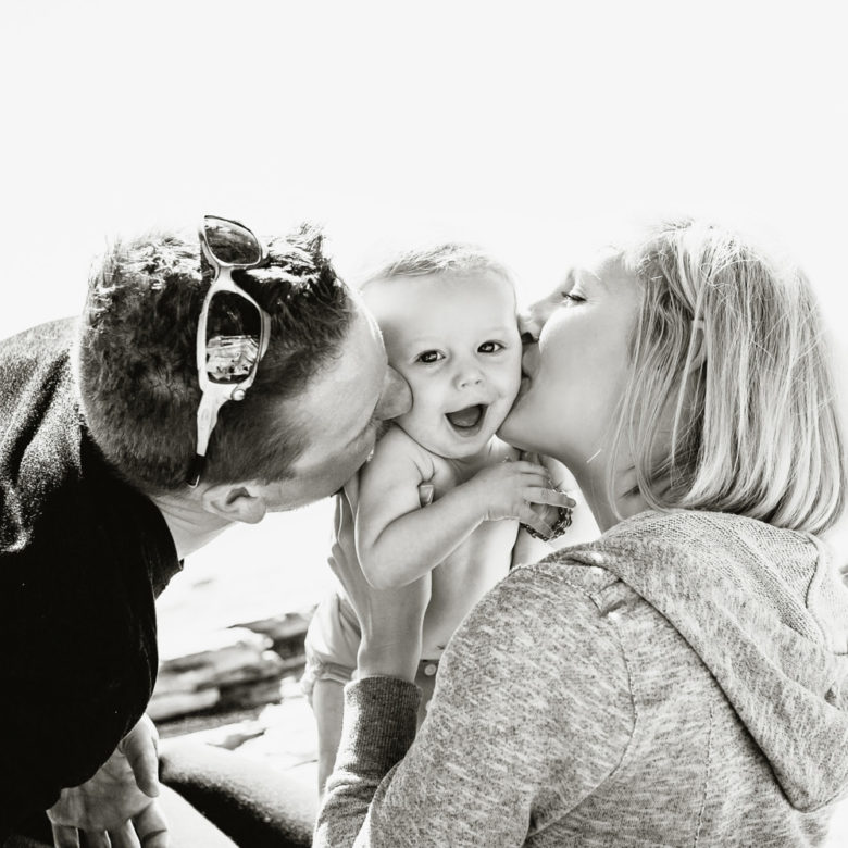
This week’s theme is negative space. Negative space is essentially space that surrounds the subject of your image and is basically left unoccupied. It may draw your attention when looking at a photo from afar, but when you get close, your eye goes to the subject and the negative space itself isn’t very important. It can be a blank space, filled with a pattern or texture, or just be an out-of-focus scene that doesn’t grab your attention away from the subject.

Here are some tips on using negative space in photography:

  1. If you make the negative space much larger than the subject, like in my middle left image above, it can capture the viewer’s attention even more. That image intentionally breaks the rule of thirds and the lack of balance between background and subjects makes the eye want to linger on the subject.
  2. You can use the sky as a blank background, creating an effect like you’re using a photo studio (see the bottom left image above). Put the sun behind your subjects and expose for the subject. Usually if the sky is bright enough, your background will go white, creating the ultimate negative space.
  3. Putting your subjects into an empty negative space can create a dramatic composition, so pay attention to where you place your subject. Think of symmetry and rule of thirds.
  4. Be careful of random distracting objects in the background as the viewer’s eye will go right to them. You don’t want to draw the eye away from your subject.

If you have any questions, join us in the Facebook group. I’ll be checking in there daily to see your work and help you achieve the best results.

If you’re just finding this now, you can check out the full list and more information on the challenge here. You can follow me on Instagram at @documentyourdaytoday and use the hashtag #dtd52weeks so others doing the challenge can see your work.

Week 34 – Rim Light

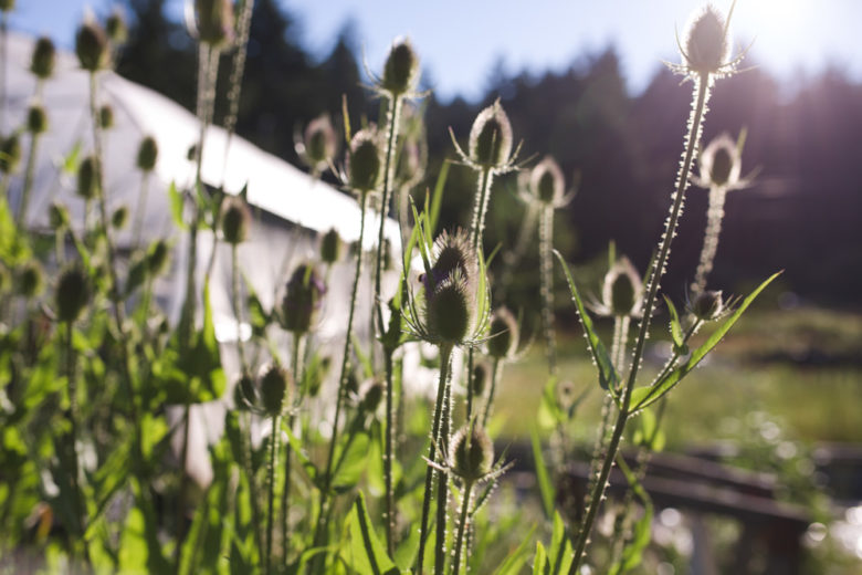
Rim light uses one of my favourite types of light: backlight. When you backlight something (i.e. put the light behind them), that thing ends up in the shade of itself, but with some light wrapping around and bouncing off surfaces in front of it. If you just have a bright sky or some other bright background behind your subject, you won’t see the bright light wrapping around its edges. But if you put something dark behind them, you’ll see a line of light around their edges. That’s rim light.
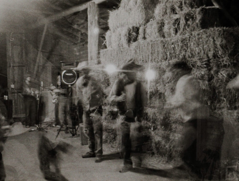
There isn’t too much to it. Just find a darker background and some light behind your subjects (or create either or both of those things). If you need some advice on getting a proper exposure, you can check out this post from when we did backlight.

Rim light often creates a pretty, glowy, kind of magical feeling. It also helps to separate your subject from the background. Think about using it in romantic or whimsical scenes or where your subject and background are similar in colour and brightness.


If you have any questions, join us in the Facebook group. I’ll be checking in there daily to see your work and help you achieve the best results.

If you’re just finding this now, you can check out the full list and more information on the challenge here. You can follow me on Instagram at @documentyourdaytoday and use the hashtag #dtd52weeks so others doing the challenge can see your work.