photography tips

Document Your Year Weekly Photography Challenge

I put together a weekly challenge a few years ago and now I’m making it an anytime challenge, so you can sign up and get the first challenge right away. Sign up below to get a weekly email of each challenge.

Practice is the best way to get better at anything. This really applies to photography. There are so many technical things to learn, you need to practice them often to make the technical part second nature. Once you’ve got the technical parts down, you can focus solely on the creative. But of course, practicing the creative parts is important too (and fun).

I hope these weekly assignments will help you learn, provide some fun, and let you create a set of photos that documents your life in the coming year.

There aren’t any hard rules for this. If you don’t get a chance to do the challenge one week, you can always catch up the next, or just skip that week. The main point of this is to get you using your camera at least once a week, if not daily.

I’ve alternated the themes over four week sets of the following categories: subject/moment, lighting, composition, and technical. The technical prompts might be a little more challenging if you’re just using a cell phone camera, but I’ll offer some workarounds for that each week.

The full list is below including links to a blog post for each week to further explain and give some examples. You’ll find this especially handy with the more technical assignments.

You can follow me on Instagram at @documentyourdaytoday and use the hashtag #dtd52weeks for the challenge. I’ll feature some of your work on my Instagram (with permission), but check out the hashtag to see everyone’s work.

Week 43 – Framing

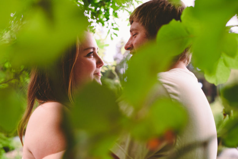
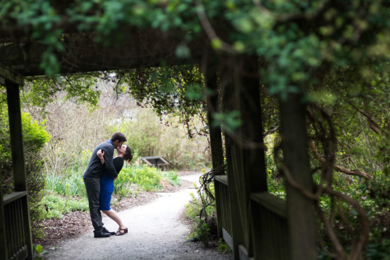
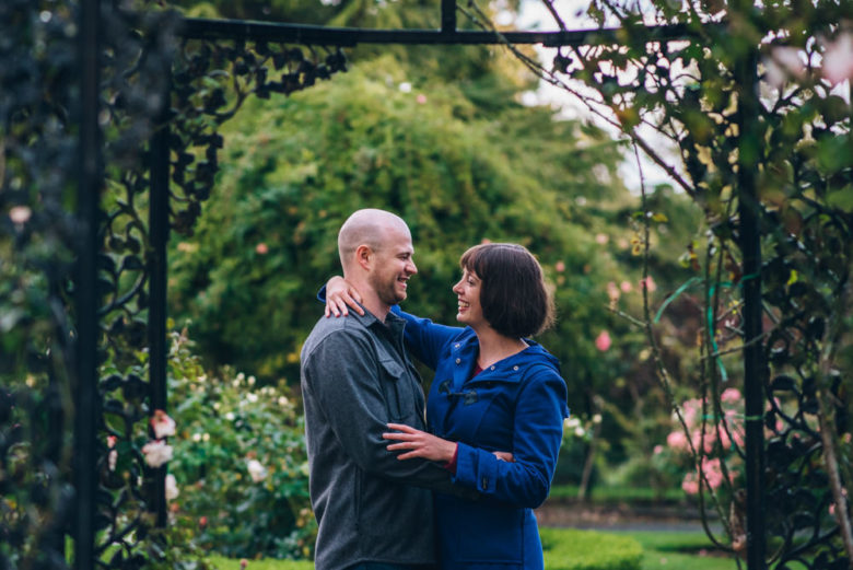
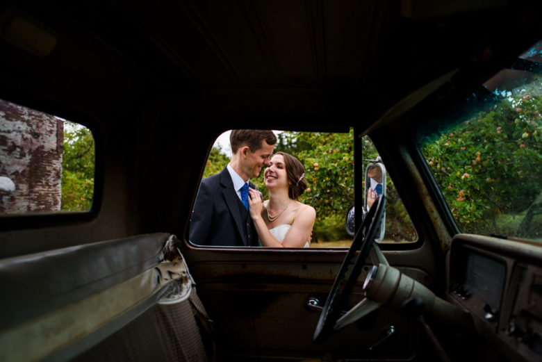
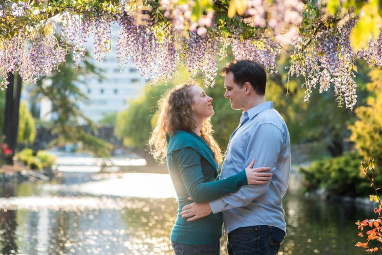
This week’s theme is framing. Framing is kind of like a picture frame, where you use elements of the scene to frame your subjects. You can use obvious things like windows, doors, and mirrors. Or you can shoot through something in the foreground, like leaves. I like putting my lens really close to leaves of a bush to create a blurry foreground element (more on this here) that puts focus on the subject and adds a pop of colour.

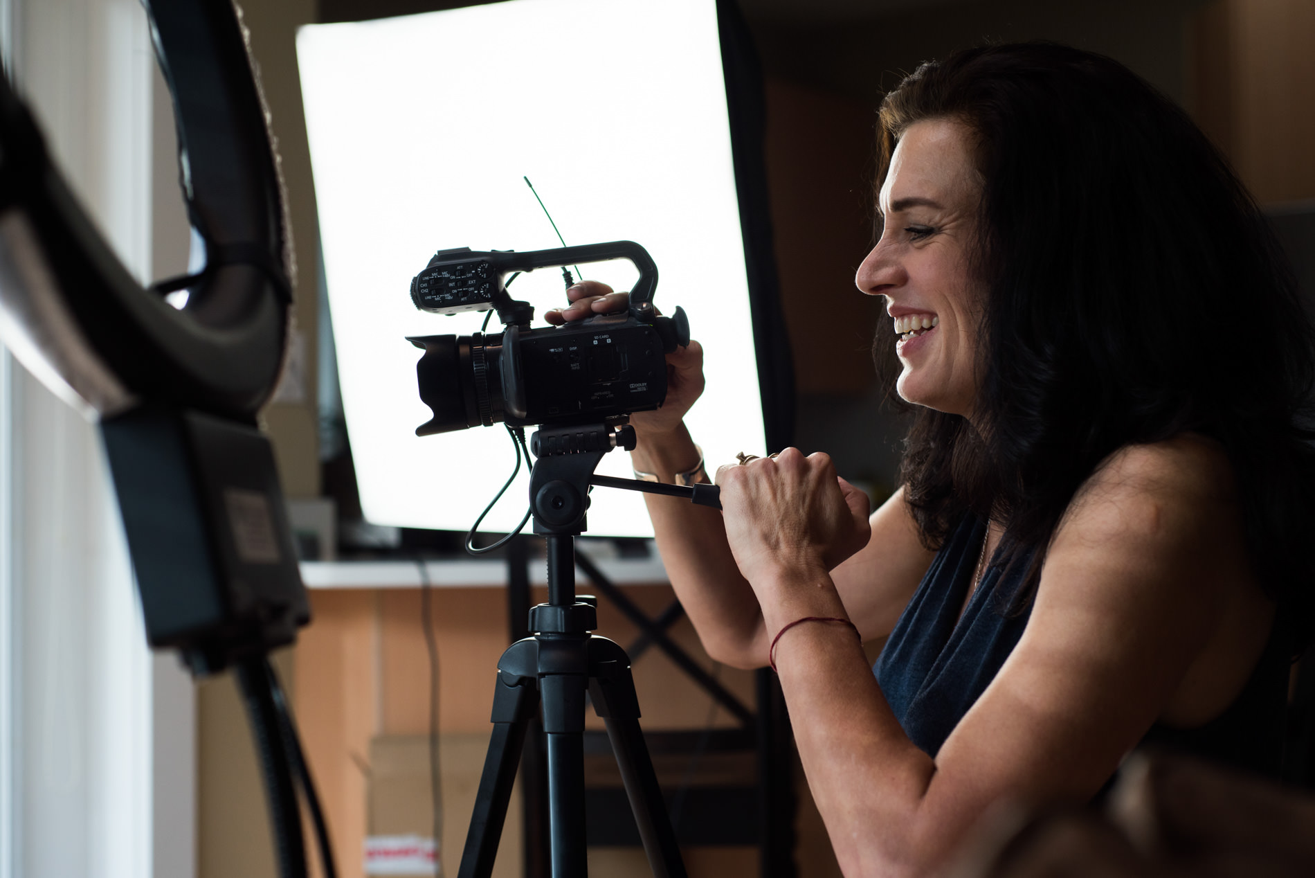
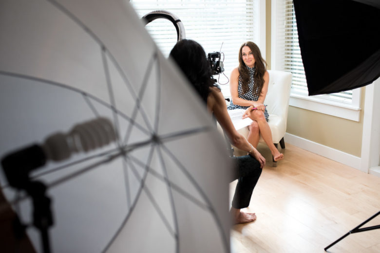
As usual with composition challenges, think about the way your eye moves through the image. The framing element(s) should draw attention to your subjects, not (just) to itself. It can also add to the story, like the photo of the couple taken through the car window or the video lighting equipment used as framing in the first photo.

Framing can also make a moment feel more intimate as it creates separation between the camera and the subjects. If can feel like peeking in on a private moment.

You can, of course, also do this with subjects other than people, like a tree, an animal, a building, etc.

One thing to be cautious with when framing your subject is focus. You’ll typically want to focus on your subject and not the frame, though rules are made to be broken. You should move your focal point around to make sure it’s on your subjects or use focus-and-recompose. If your framing element is really close to the lens, your camera probably won’t be able to focus that close anyway, so letting your camera choose what to focus on may work in that case.


If you have any questions, join us in the Facebook group. I’ll be checking in there daily to see your work and help you achieve the best results.

If you’re just finding this now, you can check out the full list and more information on the challenge here. You can follow me on Instagram at @documentyourdaytoday and use the hashtag #dtd52weeks so others doing the challenge can see your work.

Week 34 – Rim Light

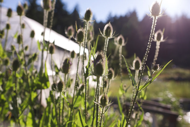
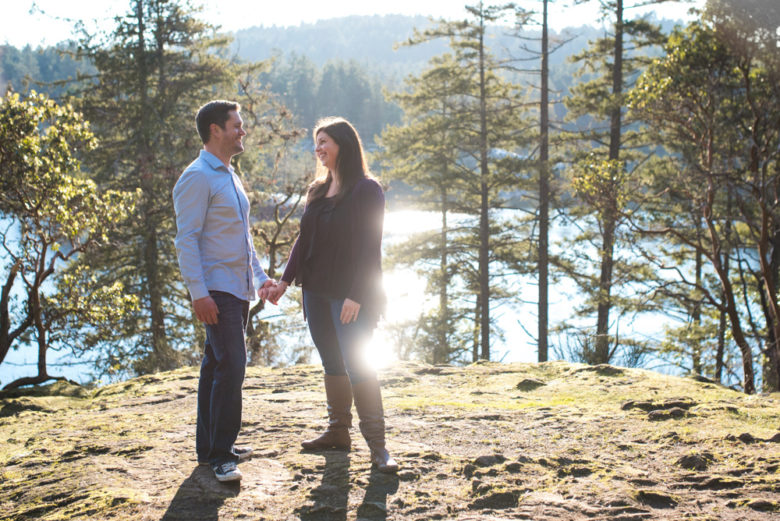
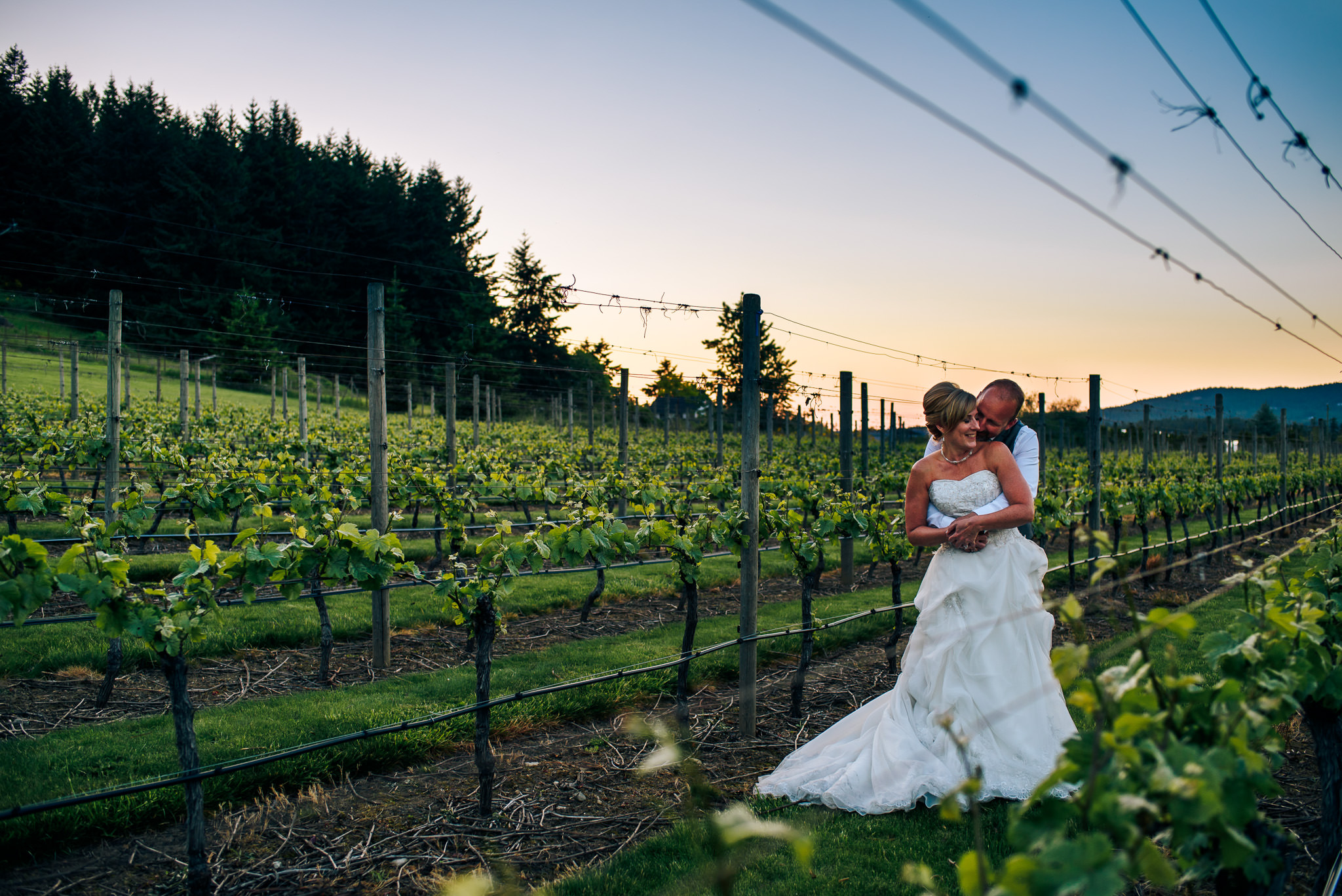
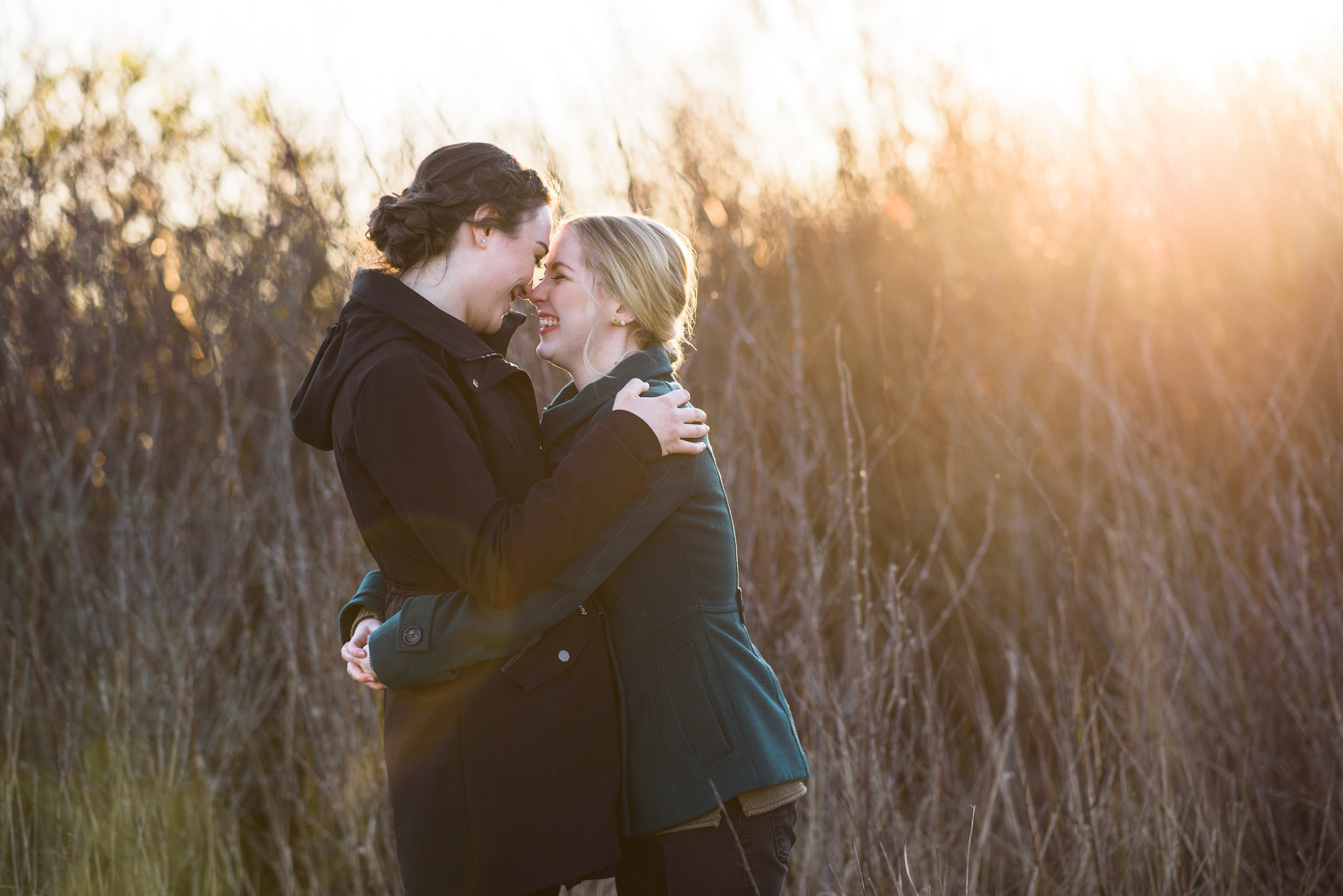
Rim light uses one of my favourite types of light: backlight. When you backlight something (i.e. put the light behind them), that thing ends up in the shade of itself, but with some light wrapping around and bouncing off surfaces in front of it. If you just have a bright sky or some other bright background behind your subject, you won’t see the bright light wrapping around its edges. But if you put something dark behind them, you’ll see a line of light around their edges. That’s rim light.

There isn’t too much to it. Just find a darker background and some light behind your subjects (or create either or both of those things). If you need some advice on getting a proper exposure, you can check out this post from when we did backlight.

Rim light often creates a pretty, glowy, kind of magical feeling. It also helps to separate your subject from the background. Think about using it in romantic or whimsical scenes or where your subject and background are similar in colour and brightness.


If you have any questions, join us in the Facebook group. I’ll be checking in there daily to see your work and help you achieve the best results.

If you’re just finding this now, you can check out the full list and more information on the challenge here. You can follow me on Instagram at @documentyourdaytoday and use the hashtag #dtd52weeks so others doing the challenge can see your work.

Week 27 – Leading Lines

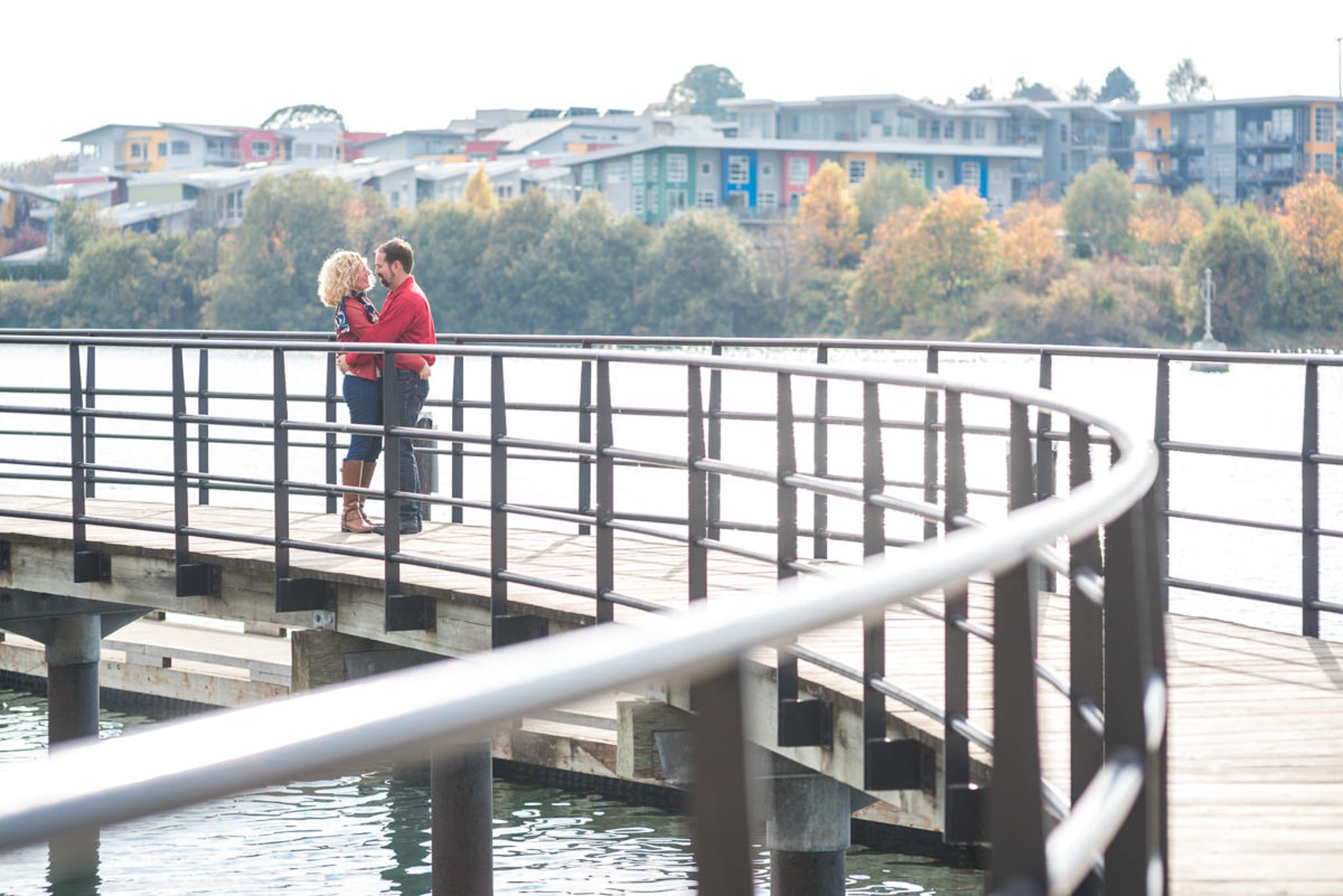
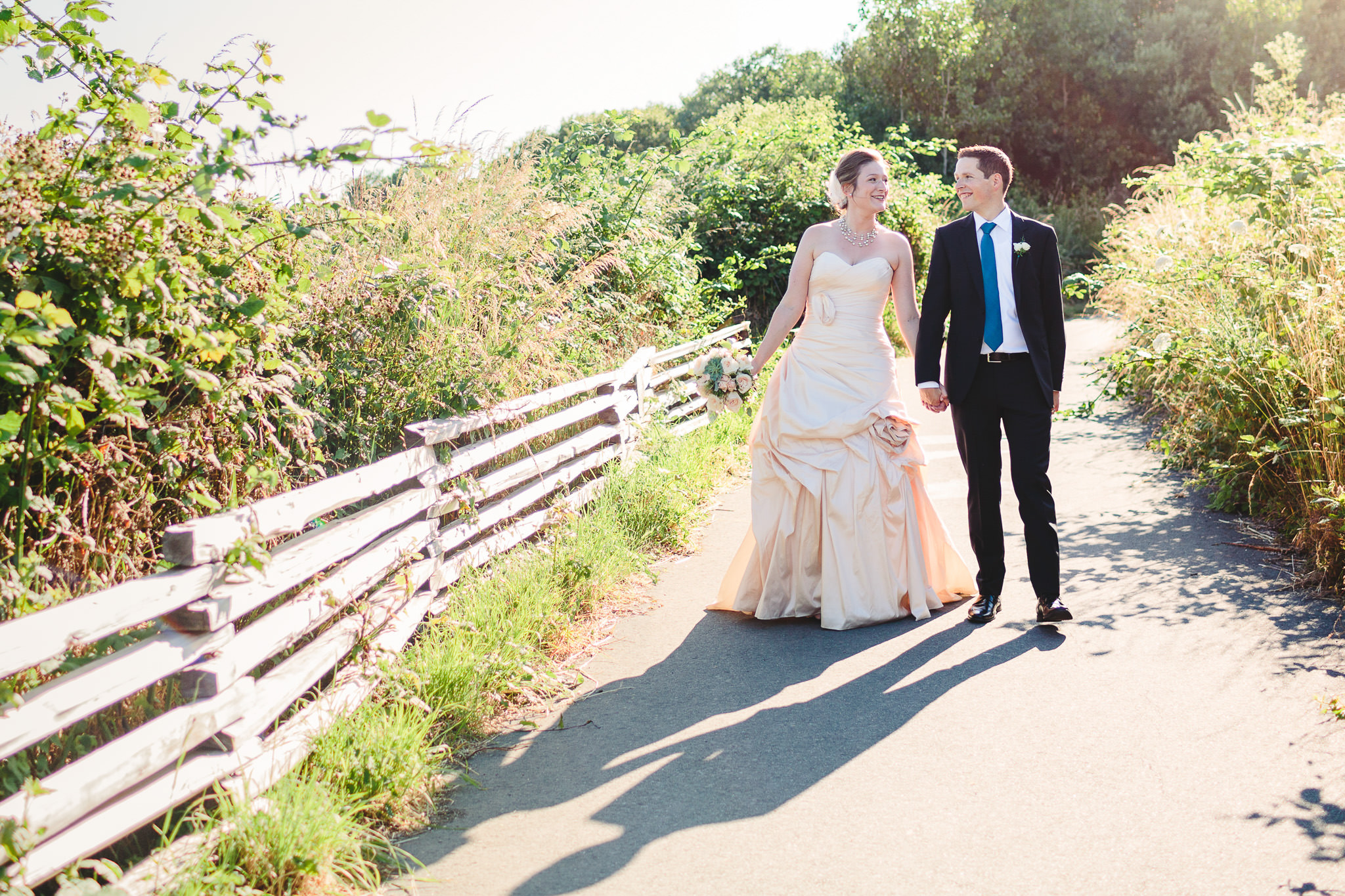
This week’s theme is leading lines. Leading lines are a way of drawing the viewer’s attention into the photo and towards the subject of the image.

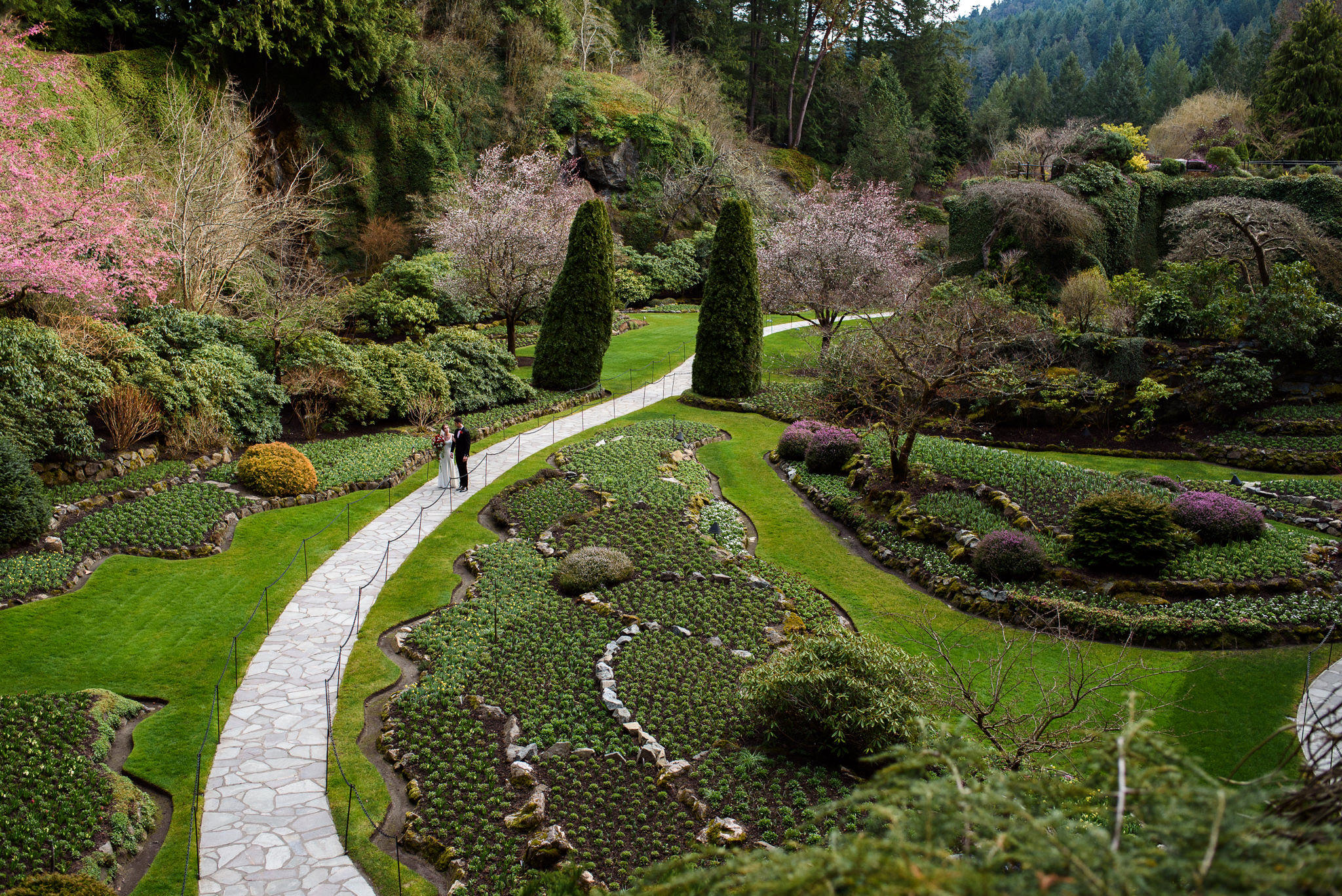
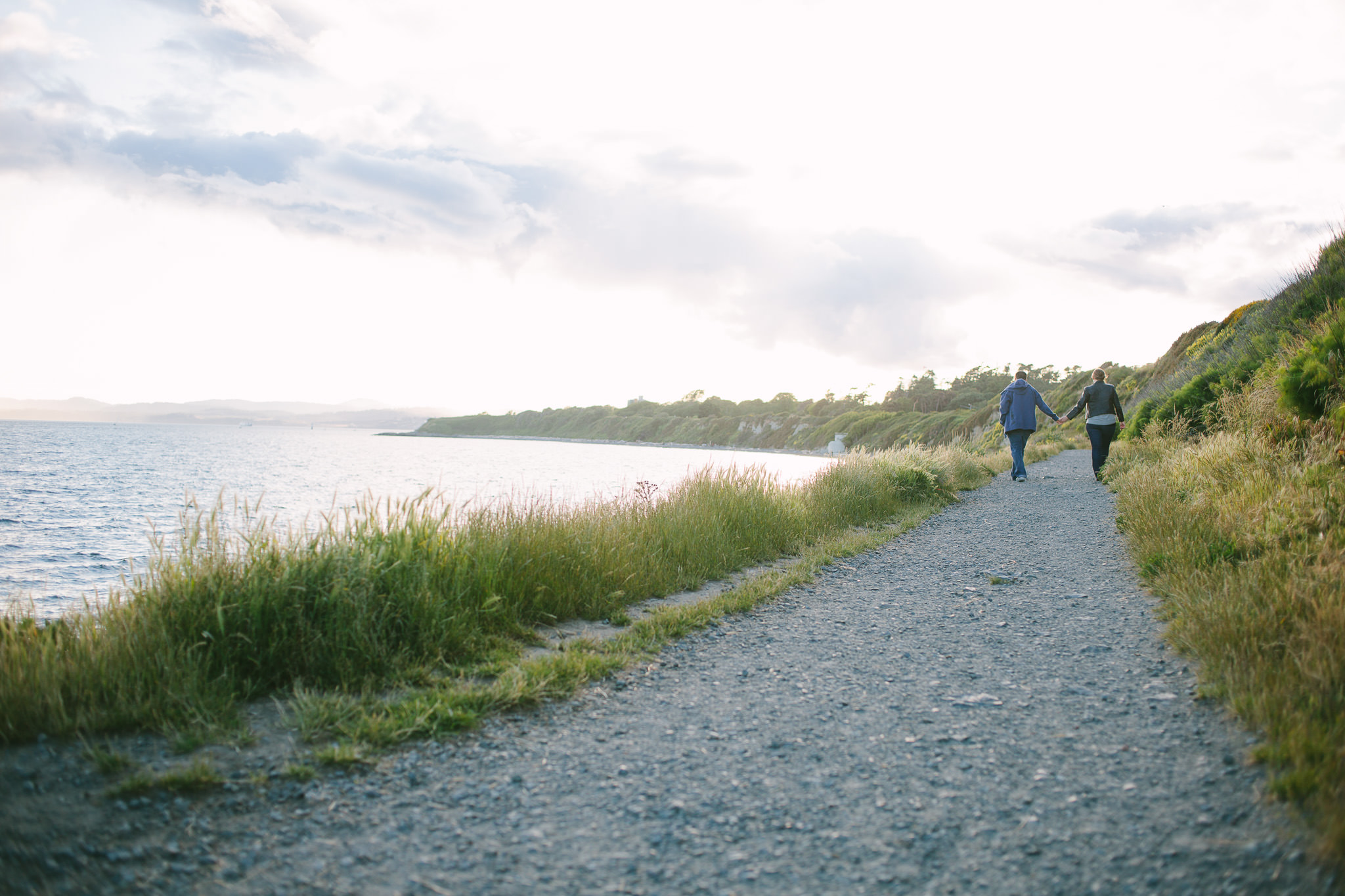
Easy places to find leading lines are roads, walls, fences, rows of trees, or shorelines. Sometimes they lead towards a specific subject and sometimes they converge at a point. Below are a few examples (mine always lead to a subject because I love photographing people). Even if they don’t lead to anything in particular, they can create depth in your image and encourage the viewer to keep looking for longer.

Here are some tips on using leading lines in your photos:

  1. Look for strong lines created by nature or the built environment. You may have to adjust your angle to get them to lead somewhere interesting.
  2. Think about the way you want your viewer’s eye to move through your image. Lines can lead from an edge towards anywhere in the frame, but they let you control the way the viewer tends to move through the image.
  3. Place your subject where the lines converge (or adjust your angle to make the lines lead to it) to create an emphasis on the subject.
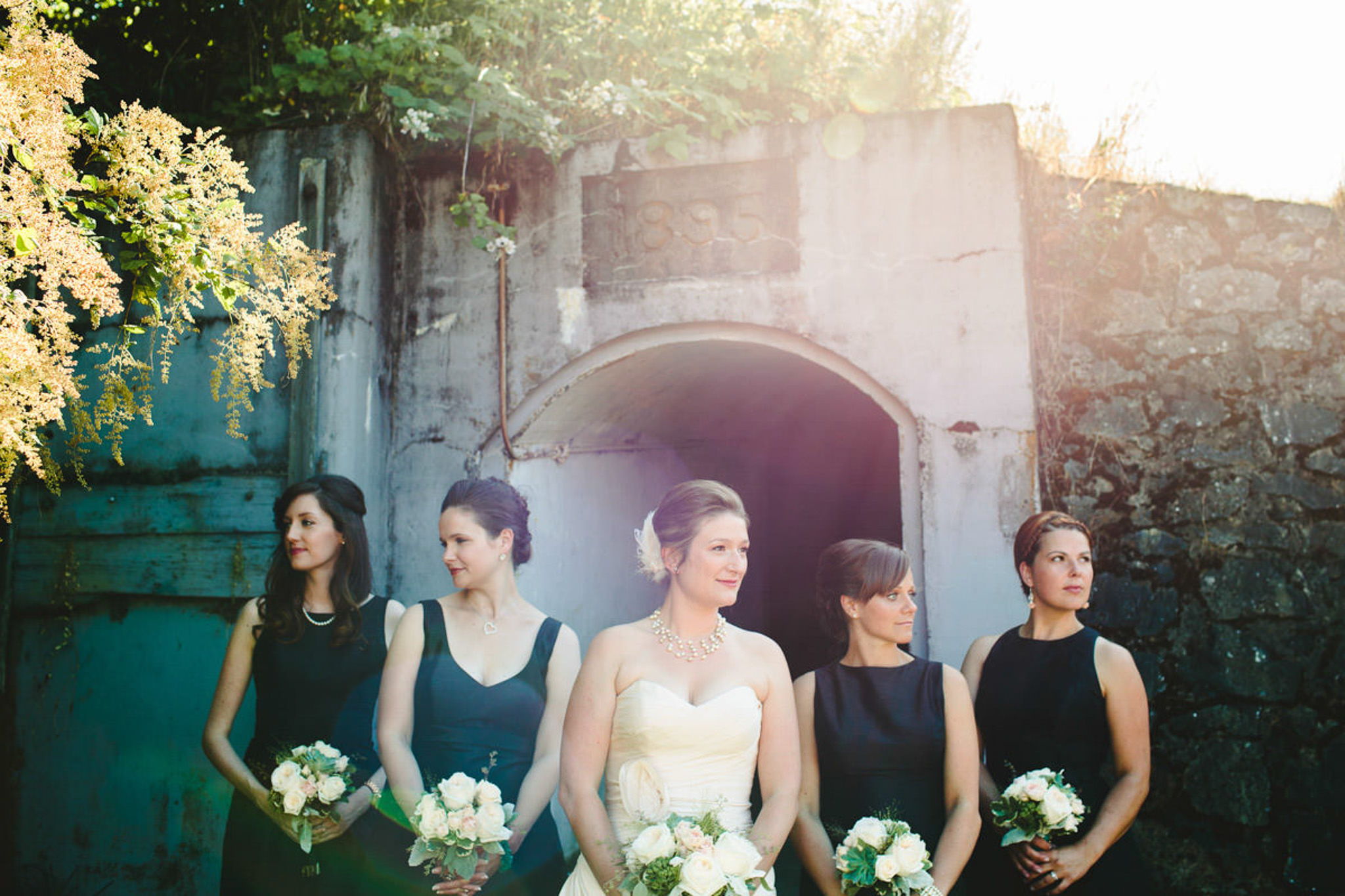
  4. A leading line doesn’t have to be straight. It can be curved or it can be less defined, like the edges of a flower bed. I included an example above where the bridesmaids create a leading line towards the bride.
  5. Be careful with strong lines that aren’t leading where you want them to. If you want the viewer’s eye to go to a subject, but there’s also a strong line that doesn’t lead towards the subject, it’ll create confusion and can draw the eye away from the subject.

If you have any questions, join us in the Facebook group. I’ll be checking in there daily to see your work and help you achieve the best results.

If you’re just finding this now, you can check out the full list and more information on the challenge here. You can follow me on Instagram at @documentyourdaytoday and use the hashtag #dtd52weeks so others doing the challenge can see your work.
Week 26 – Sun Flare

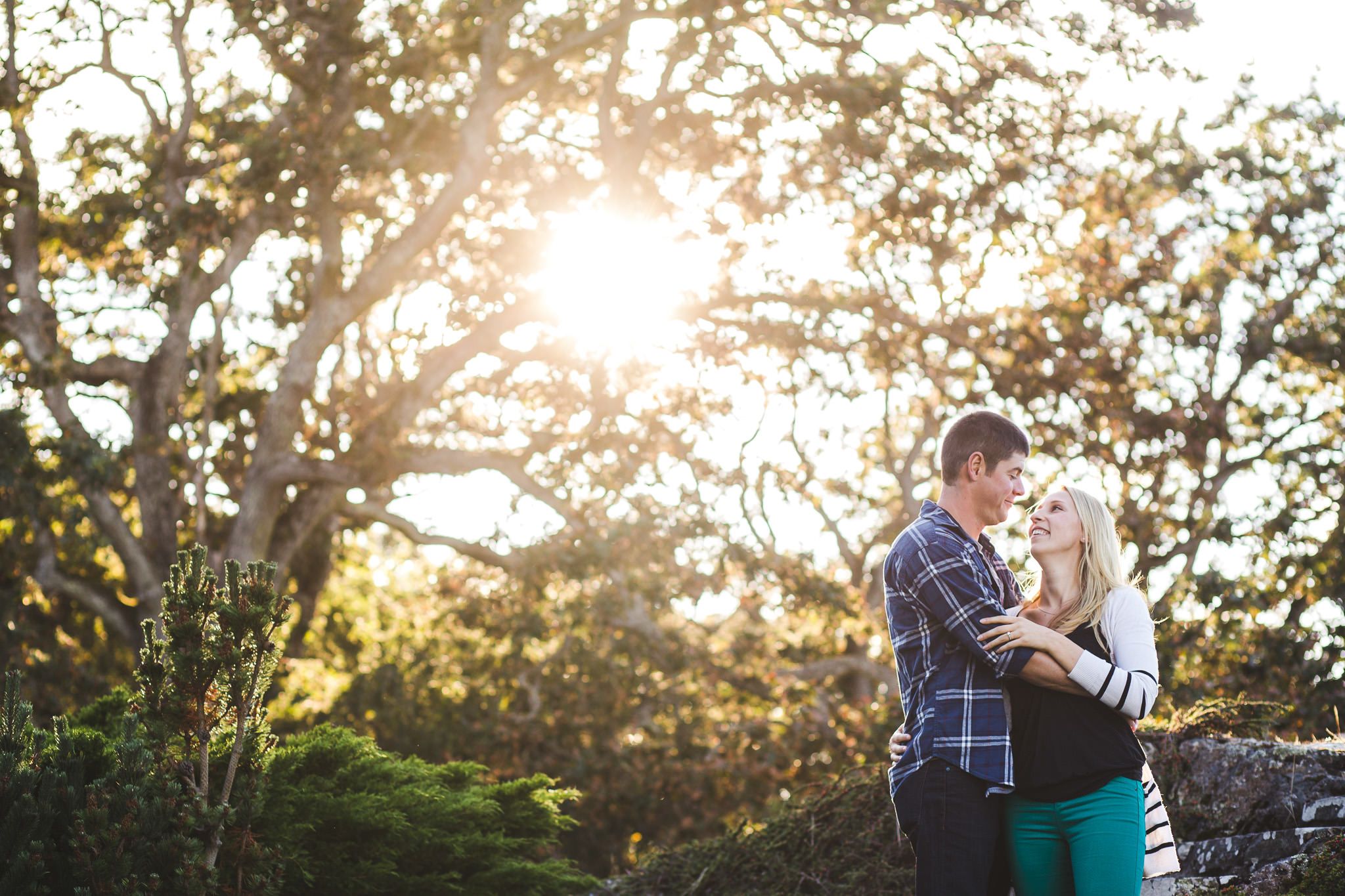
This week’s theme is sun flare or lens flare. Sun flare usually happens when the sun hits the front of your lens, creating effects including starbursts, colourful lens flare shapes or streaks, and haze. Below are some examples of each of these, followed by some tips on how to achieve it.

Here are some tips on getting sun flare in your images:

  1. Place your subject with their back to the sun (i.e. have the sun in front of your camera). I’d recommend aiming at something in front of the sun, not at the sun itself. Looking at the sun through your camera can be very bad for your eyes.
  2. Watch the flare through your viewfinder or LCD while composing your image. You should be able to see it, especially the colourful shapes created by it. Move your camera around to change the location and effect of the flare.
  3. If you want flare, you need to let the sun hit the lens. Things that can prevent this are lens hoods (the plastic cylinder that you can remove from the front of your lens – they come with some lenses), standing under an overhang, or blocking the sun with trees or other objects. So, of course, if you want flare, avoid those things.
  4. Lens flare is often considered undesirable, so more expensive and modern lenses are designed to avoid it. You may get more flare using an older or cheaper lens. A cheap filter that screws onto the front of the lens can also cause flare.
  5. If you want a starburst effect, try using a higher aperture. The top left image here was taken at f13. It also helps to hide the sun partly behind something, so the rays are more obvious against the background.
  6. It can be tough to focus with a lot of light coming into the lens. You can block the sun temporarily by holding your hand up in front of and above the lens to get your focus, the remove it before taking the photo. Once you’ve focused once, you can lock focus by switching to manual focus or using autofocus lock (look up AF lock or AF-on in the manual or Google) so you don’t have to keep refocusing, assuming you’re keeping the same distance from your subject for multiple photos.
  7. Golden hour is a good time to get this effect because the sun is lower in the sky, so you can aim at the sun without crazy angles.

If you have any questions, join us in the Facebook group. I’ll be checking in there daily to see your work and help you achieve the best results.

If you’re just finding this now, you can check out the full list and more information on the challenge here. You can follow me on Instagram at @documentyourdaytoday and use the hashtag #dtd52weeks so others doing the challenge can see your work.

Week 25 – Photograph Emotion Without Showing a Face

This week’s theme is emotion without a face (i.e. conveying emotion without including someone’s face). This is primarily about body language and I’ve included some examples below. Some of them show parts of faces, but the focus is on the rest of their bodies, not their faces. I’ll let you interpret the emotions yourself. This is pretty simple, so I don’t have any tips this week. Good luck finding (or creating) some expressive body language!


If you have any questions, join us in the Facebook group. I’ll be checking in there daily to see your work and help you achieve the best results.
If you’re just finding this now, you can check out the full list and more information on the challenge here. You can follow me on Instagram at @documentyourdaytoday and use the hashtag #dtd52weeks so others doing the challenge can see your work.

Week 24 – Foreground Focus

This week’s theme is foreground focus. What I mean by that is focusing on something that isn’t the main subject of the image or story. Or focusing on one of two subjects/elements of your image while the other is blurred. This could also work with the foreground element blurred and there’s an example of this at the end.

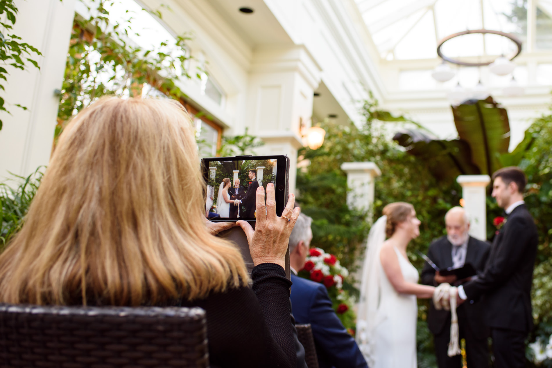
I actually don’t have a lot of examples of this (or at least couldn’t find many because I didn’t have time to go through hundreds of thousands of photos to find more). I’m going to do my best to explain it with a few examples. Below is a good example of one thing happening while another closely-related thing happens in the background. The story of the image is this relative taking photos of the wedding ceremony and the focus is on that. The couple in the background provides balance to the composition and a mirror image of her LCD.

The below image is focused on the speaker, whose face you can’t see. He becomes the most important thing here because he’s the most in focus, but the crowd listening is also a part of the story.

The below image is a bit different because it’s the same group of subjects in focus and out of focus, but putting the focus on the child’s feet creates a more visually interesting image than the reverse. You can also get a clearer idea of what they’re reading with this focus and angle than you would if I tried to get their faces sharp and in full view. Plus, her toes are super cute.

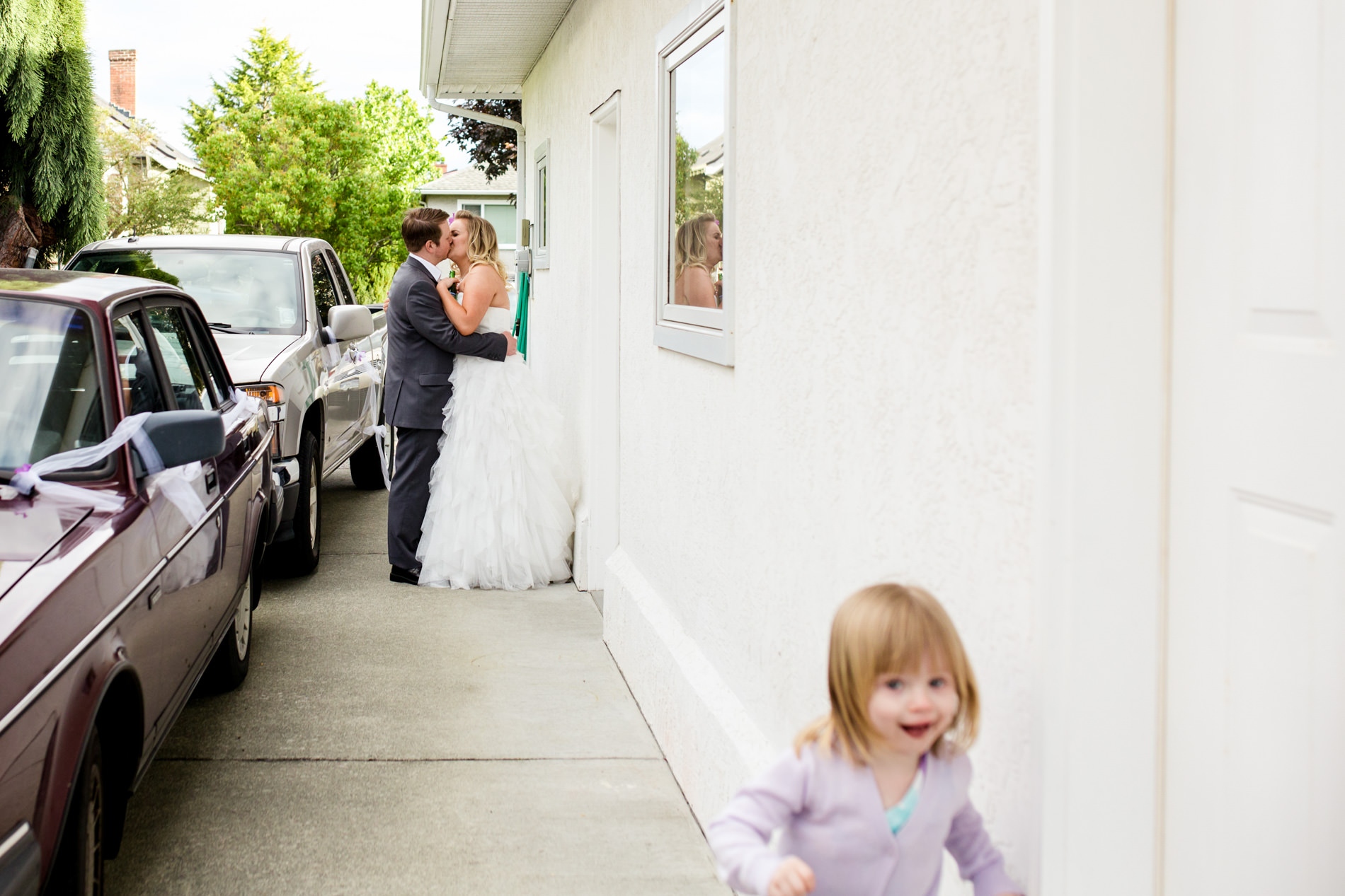
Here’s an example where in hindsight, I think focusing on the foreground would have been better. I just wasn’t quick enough. This kid ran by the couple and past me as we were taking some portraits. You can still make out her expression, but I kind of wish she was the focus of the photo.

So the main idea is to start telling stories with multiple components. Try photographing a scene where you could get a good photo by focusing on the background instead, but changing the focus changes what the viewer sees as important.


If you have any questions, join us in the Facebook group. I’ll be checking in there daily to see your work and help you achieve the best results.

If you’re just finding this now, you can check out the full list and more information on the challenge here. You can follow me on Instagram at @documentyourdaytoday and use the hashtag #dtd52weeks so others doing the challenge can see your work.

Week 23 – Photograph at Subject Level

We talked about photographing from a high angle and a low angle, so this week is about photographing at the subject level, meaning getting on the same level as your subject.

There’s not much to this theme, so I’m just going to make a list of times when photographing from subject level can be useful.

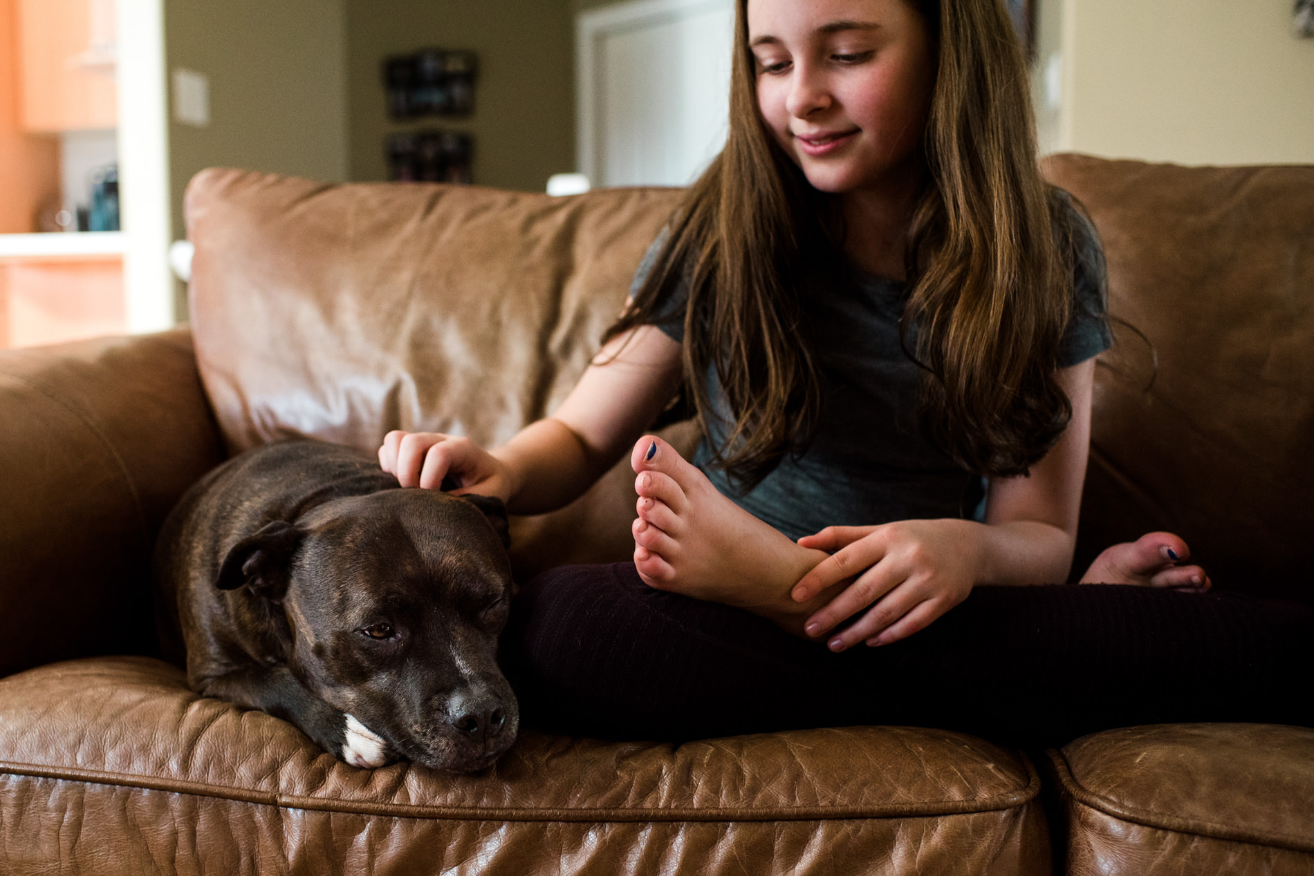
  1. When photographing children or animals. People are so used to seeing children and animals, especially pets, from above, so it can be different to see them on their own level. It also brings you more into their world, getting closer to their point of view.
  2. When you want yourself to be less noticeable. By that, I mean you’re getting more into the scene and more intimate with your subjects. When you use an obvious angle like the high or low angle, the photo can become more about the photographer and their point of view. Subject level is more about the subject’s point of view and can draw the viewer into the moment and emotion.
  3. When you want parallel lines to appear parallel, like on a building or a block wall, for example. If you shoot at an angle, perspective causes lines to converge towards one another. If you take the photo straight on, at subject level, the lines will appear more parallel and perpendicular.
  4. One little tip: if you have a tiltable LCD on your camera, use it with live view to get a lower angle without having to sit or lay on the ground.

If you have any questions, join us in the Facebook group. I’ll be checking in there daily to see your work and help you achieve the best results.

If you’re just finding this now, you can check out the full list and more information on the challenge here. You can follow me on Instagram at @documentyourdaytoday and use the hashtag #dtd52weeks so others doing the challenge can see your work.

Week 22 – Artificial Light

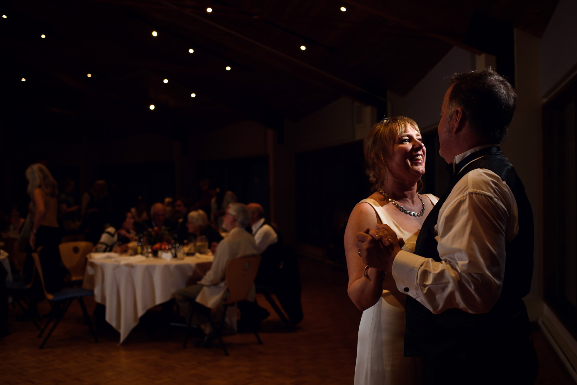
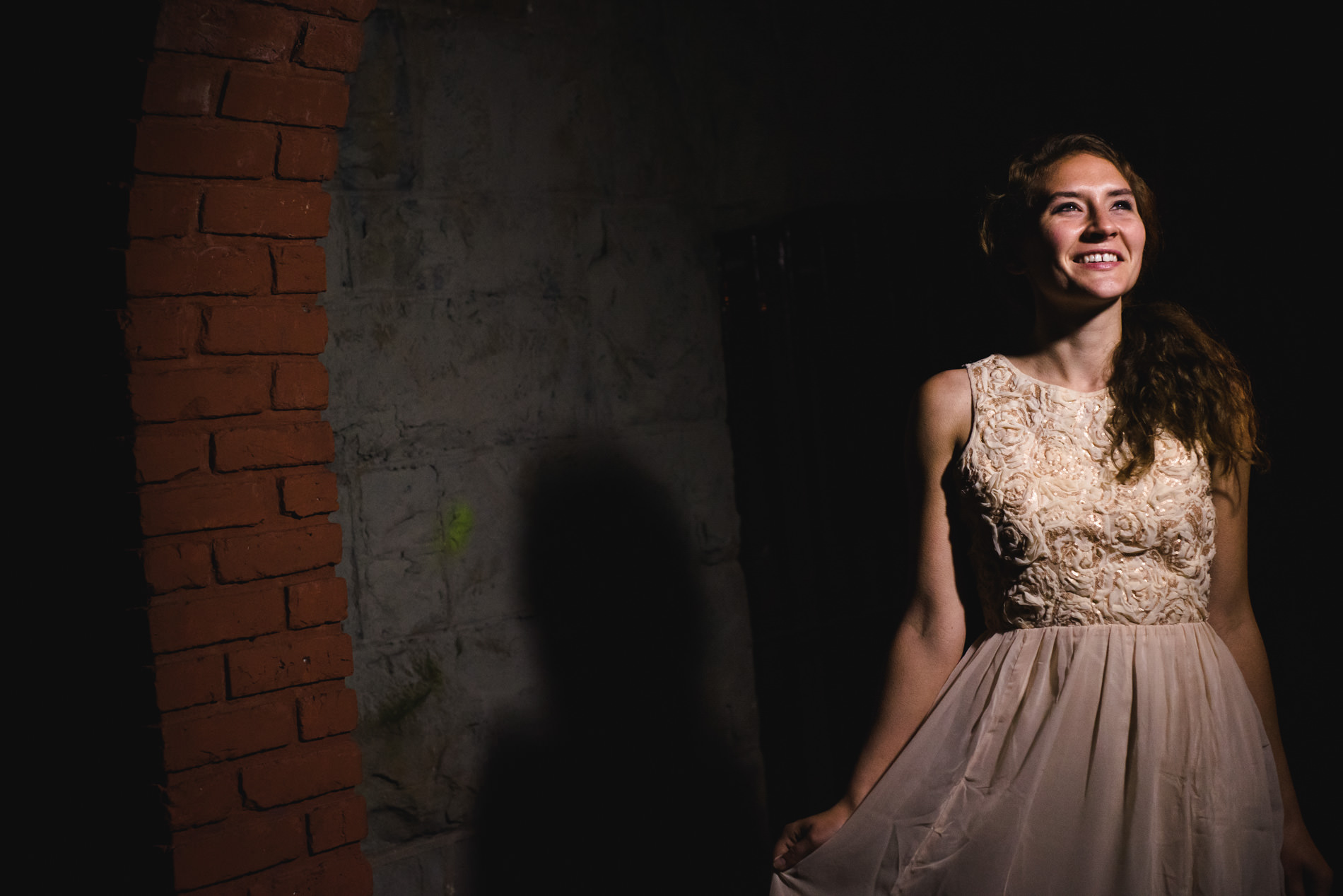
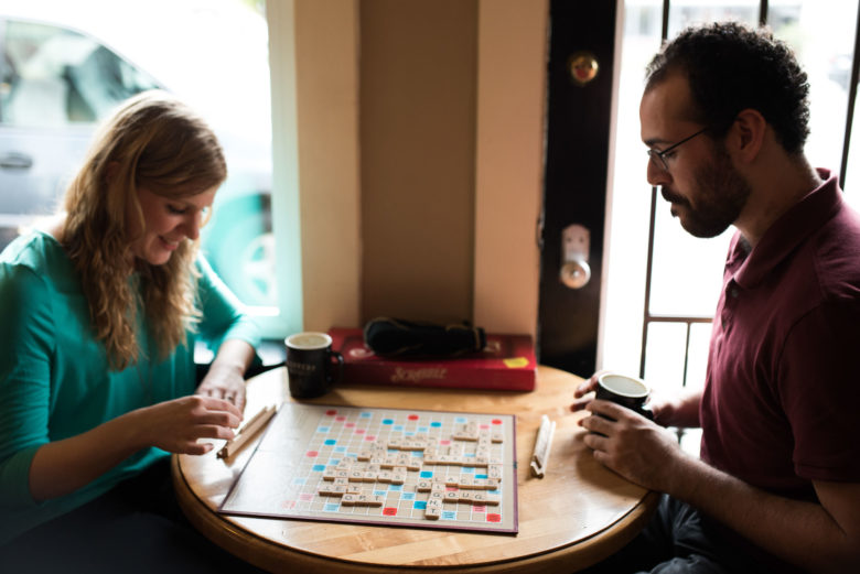
This week’s theme is artificial light. This can include flash, indoor lighting, video lights, or whatever else you can find (street lights, flashlights, sparklers, etc.) The examples below are lit by (from L-R for each row): indoor tungsten lighting in a pub, indoor fluorescent lighting in a store, subtle bounce flash on the couple with tungsten lighting in the background, harsher off-camera flash on the couple with tungsten background lighting that’s mostly drowned out by the flash being so bright, video light at front-side, video light behind the subject and mostly natural light on her face.

Here are some tips on using artificial light:

  1. I might have talked about this when talking about window light, but be careful with mixed lighting. If you have indoor lighting and a lot of window light, you might end up with weird colours or skin tones. This is why I generally prefer to use natural light in the daytime (and turn off indoor lighting) and use indoor lighting alone at night. Fluorescent like they use in offices and stores tend to have weird colours either way, but tungsten and compact fluorescent lights are decent if there’s no other colours of light interfering.
  2. Try using flash. If you have an external flash, you can point it at the ceiling or walls if they’re a neutral colour. This turns the ceiling or walls into a big, flattering light source. That’s what I did in the third image (with the couple dancing with a visible background). I exposed a bit darker than I would with no flash and then added some subtle flash, pointed at the ceiling, to put a nice, clean light on the couple. The image to the right of it was under exposed a lot, then off-camera flash was added to the side to create a more dramatic light on the couple. The background lighting (ambient exposure) is determined by your exposure before adding flash. The exposure of the subjects is determined by the flash and the ambient light combined. So if you set your exposure to be close to a proper exposure without flash, your flash will be less powerful and create a more natural-looking effect.
  3. I used a video light in the last two images. Actually, the first was at a meetup lead by Christina Craft and someone else held the light and the second, I just used the light that the videographer set up. But sometimes I use my own video lights as an easy light source. Video lights are great because they provide a constant light source so you can see what your lighting will look like before you take the photo. Flash takes a bit more trial and error. If you don’t have an actual video light, you can try using a flashlight, a lantern, a lamp, or a shop light for a similar effect (though probably not as powerful).

If you have any questions, join us in the Facebook group. I’ll be checking in there daily to see your work and help you achieve the best results.

If you’re just finding this now, you can check out the full list and more information on the challenge here. You can follow me on Instagram at @documentyourdaytoday and use the hashtag #dtd52weeks so others doing the challenge can see your work.

Week 21 – Photograph an Activity

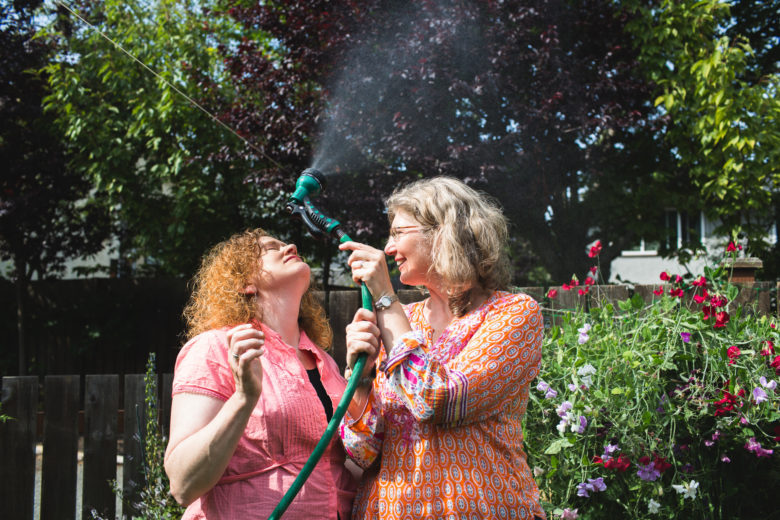
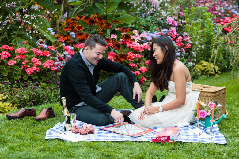
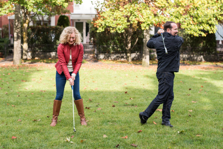
This week’s theme is to photograph an activity. It’s so simple, I’m going to forgo giving any tips this week. But think about telling a story and maybe try using a slow shutter speed to show motion if you’re up for an extra challenge. Below are some examples to hopefully spark some inspiration.


If you have any questions, join us in the Facebook group. I’ll be checking in there daily to see your work and help you achieve the best results.

If you’re just finding this now, you can check out the full list and more information on the challenge here. You can follow me on Instagram at @documentyourdaytoday and use the hashtag #dtd52weeks so others doing the challenge can see your work.